QS Supplies
Call UsCall Us

Call Us: 0116 251 0051Call us today until 5:00pm

Colour of the Year 2019

By 84 Top Interior Designers

Colours are an integral part of design and come in incredible palettes that can invoke relaxation or provoke and energize. When creating a colour scheme for the interior décor, there are many factors to consider, including the kind of colours, the personality of the user and sensibilities with colour. Our yearly online survey with renowned interior designers continued this year as well, where their choices let us draw-up our winning shades in 2019. Our survey covered 84 Design experts worldwide whose daily work with hues and designs gives them a deep insight into fashion and classic trends.

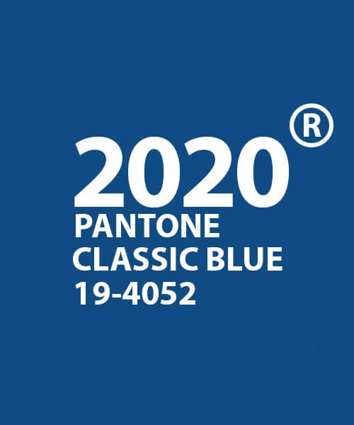
Let us see which are the colours that will adorn our living and office spaces this year. The Pink-tinted 'Living Coral' is Pantone’s "Colour of the Year", 2019. In the race for the top-spot, the gold-orange tone wins, beating competitors like blue, greens and grays and is the first time that Pantone has picked a Pinkish hue as 'Colour of the Year.' Pantone believes that 'Living Coral,' shade of orange with gold undertones represents bold and animated living.

Colour Experts at Dulux went with the rather subtle 'Spiced Honey', a warm amber tone inspired by the golden liquid-Honey. The hue reflects the versatility of honey, which can be vibrant or calming when combined with the other hues in the colour spectrum. Sherwin Williams' official choice is Cavern Clay, representing simplicity, free spirit and rejuvenation. Metropolitan, a stylish grey is Benjamin Moore’s choice for The Colour of the Year. This cool shade from the neutral part of the spectrum depicts calmness, smoothness and understated glam.

Lori Dennis

Lori Dennis

Lori Dennis, INC.

"This year it's waves of coastal blues and greens, corals, pinks, and camel neutrals making a splash in our interiors."

  • PANTONE
    2454 C
    #277DA1
  • PANTONE
    2459 C
    #55AF92
  • PANTONE
    16-1546 TCX
    #FF6F61
Kerrie Kelly

Kerrie Kelly

Kerrie Kelly Design Lab

"Bright and bold colors stand out in designer showrooms, but can be overwhelming to live with. Subtle and classic color palettes, featuring earth tones and cool blues, will replace them."

  • PANTONE
    19-4024 TCX
    #2A3244
  • PANTONE
    17-1052 TCX
    #93592B
  • PANTONE
    15-1040 TPG
    #B69573
Martyn White Designs

Martyn White

Martyn White Designs

"As a continuation from my selection last year, I am seeing such a response to rich blue hues. I think the fascination with this colour will only increase throughout the year as people explore using darker colour palettes in their home. The stand-out Pantone for me this year is 289. It has a richness and warmth that is not often associated with blue which makes it all the more appealing. "

  • PANTONE
    289 C
    #0C2340
Yanic Simard

"For 2019, organic and natural elements are the focus. Think speckled terrazzo, buffed concrete, and lusciously grained wood. The colours I use in a space are derived from the materials as such. This year, it's all about Sage and Eucalyptus tones, because that is what the surrounding environmental materials are calling for.
This near-neutral colour works in harmony with the finishes we are seeing. 5527-C is my new chameleon colour. Weather your space is modern, traditional, or something in-between, it works. Gently, freely and beautifully."

  • PANTONE
    5527 C
    #BCC9C5
Alison Green

Alison Green

Twist Interiors

"We love the Vibrant, yet mellow PANTONE 16-1546 Living Coral embraces us with warmth in our interiors. PANTONE 16-1546 Living Coral emits the desired, familiar, and energising aspects of colour found in nature. Works so well with a blue pallet then paired with gold or bronze accessories and furnishings."

  • PANTONE
    16-1546 TCX
    #FF6F61
Joe Human

Joe Human

Designs By Human., Inc

"I love color but we are finding we like lots of color in accents which is why Pantone #19-0203 "Gray Pinstripe" is our choice. We want to use it in walls as it reads as a bold neutral color allowing you to layer in mustard's, blues and greens all in one palette creating a rich and luxurious feeling."

  • PANTONE
    19-0203
    #555459
Aarti Popat

Aarti Popat

Aarti Popat Interior Design

"Colours to rule 2019 are jewelled tones, we had neutral last year and this year is about making a change, making an impact.

I love this emerald - aqua green tone in accent accessories in an already dark room or even a panelled wall feature with the panels creating depth of to the colour with variances in shadow and light."

  • PANTONE
    7716 C
    #00968F
  • PANTONE
    110 C
    #DAAA00
  • PANTONE
    258 C
    #8C4799
Maurizio Pellizzoni

Maurizio Pellizzoni

Maurizio Pellizzoni Ltd

"A spectrum of pink shades have been in vogue for sometime now. Millennial Pink has been particularly popular and is still very much used in interior design and fashion houses.
Pantone's ‘Harry Styles Pink’ is a deeper and more solid shade of this colour and is very much on trend for 2019. Used as a signature colour or simply to inject a bright tone into a scheme, the vibrant hue works particularly well with metals such as gold, silver and copper in addition to contrasting colours like Navy Blue. "

  • PANTONE
    Harry Styles Pink
    #F7C1C3
Darla Powell

Darla Powell

Darla Powell Interiors

"I really am digging green right now. When I see green kitchen cabinets my heart just soars. Sherwin Williams Pewter Green strikes my fancy."

  • Pewter Green
    SW 6208
    #5e6259
Sam Marlow

Sam Marlow

Lime Lace

"Earthy colours that were big in 2018 will continue to be popular well into 2019. Calm and relaxing, these clay hues will be complemented perfectly with pastel shades of mint.
Home accessories & soft furnishings are the perfect way to introduce mint green into your interior scheme and can be easily (and more cheaply!) changed when the next trend comes along!"

  • PANTONE
    7531 U
    #8B7F79
  • PANTONE
    480 C
    #C6A992
  • PANTONE 351 C
    #A2E4B8
Arjan Nijen Twilhaar

Arjan Nijen Twilhaar

Aiden T

"Pantone 561 I am drawn to this deep and vibrant green colour as accent walls and backsplash tiles. The colour works especially well with muted greys and I think we will see a lot more green popping up. This colour in a rich velvet for upholstery will bring a luxurious touch to any interior.

Pantone 110 As an accent colour, this golden ochre is perfect. I am proposing accent chairs and even dining chairs in this colour as they offer the perfect pop. I think you can never go wrong with some yellow to brighten up the home. If you prefer to work with a neutral palette in the home, then this colour will be perfect for an throw cushion or other small accessories."

  • PANTONE
    561 C
    #00594C
  • PANTONE
    110 C
    #DAAA00
Fabiola Avelino

Fabiola Avelino

Fabiola Avelino Interiors

"In 2019 we are going back to basics with soothing shades of whites and blacks. This color combination, classic and always in style, allows all designs elements to stand out. Neutral and elegant, when shades of whites have a "whisper" of color, as in Ivory, it creates a fresh and open, yet embracing feel. While the blacks bring the posh, and contemporary high contrast."

  • PANTONE
    11-0602 TCX
    #F2F0EB
  • PANTONE
    419 C
    #212322
Amy Wax

Amy Wax

Your Color Source Studios, Inc

"This will be a year of people trying colors that are a little more adventuresome. Here are colors I see being used this year:
SPA DAY Benjamin Moore CSP-635
The quiet blue grays of the past have evolved into a more saturated teal with a more creative spirit to it. A brilliant color it can be used alongside a neutral color palette as an accent color or as the primary color in a design to make a bolder design statement.
BERRY FIZZ Benjamin Moore CSP-440
An updated version of traditional burgundy, this color is refreshing and grabs your attention. This is a great color to use if you want your color to add excitement to your design, with an updated, younger look from colors we would have used in previous years!"

  • Spa Day
    CSP-635
    #6DA5B1
  • Berry Fizz
    CSP-440
    #964163
Elisabetta Rizzato

Elisabetta Rizzato

ITALIANBARK

"My choice is mustard yellow, Pantone Spicy Mustard 14-0952"

  • PANTONE
    14-0952 TPG
    #DBAE49
Shelley Nordlund

Shelley Nordlund

Transformations for Interiors

"At Transformations for Interiors, we’re in love with Pantone’s Living Coral 1546, Color of the Year for 2019! This cheery hue works with so many neutrals (think grey, taupe, black,) and is an amazing complement to navy, which has been around for nearly a decade. It’s an easy add-on for an accent hue to update any room in your home. This joyful color will work with so many other combinations of colors that we love to consider all the possibilities for our clients ready for a major change or minor addition."

  • PANTONE
    16-1546 TCX
    #FF6F61
Stefania Skrabak

Stefania Skrabak

Art Home Garden LLC

"Playing off this year's fashions trends I believe the 70's earthy colors of the desert will be 2019 color trend of 2019. My top picks are reminiscing sun-kissed soil, rich coppers and burnt browns of the southwest."

  • PANTONE
    2309 C
    #E7CEB5
  • PANTONE
    7611 C
    #DDBCB0
  • PANTONE
    7613 C
    #BC8A7E
  • PANTONE
    2468 C
    #97694C
  • PANTONE
    2477 C
    #705853
Anna-Carin McNamara

Anna-Carin McNamara

ANNA CARIN design [ACD]

"During a client meeting we were searching for a kitchen cabinet colour to work with a beautiful limestone bench top and concrete floor. Hanging in our studio is a stunning oil painting by Sokquon Tran. Holding the Pantone fan deck up to the oil painting we selected the perfect dusty blue shade - Pantone 5445 U. Khaki shade 451U pairs well together. Desaturated blues and greens will be the colours for 2019 used in place of neutral colours."

  • PANTONE
    5445 U
    #B4C7D3
  • PANTONE
    451 U
    #929172
Natalie Kraiem

Natalie Kraiem

Natalie Kraiem Interiors

"Mint green is making a huge come back in 2019! This color is soft, soothing, and it helps brings the outside - inside. It's great for areas with natural light like sitting rooms, dinettes, or any general space. I love this color because it is warm and airy yet the color makes a huge statement - it's definitely not what you would typically expect to see which is what I love about it!"

  • Pine Barrens
    437
    #D1DAC6
Diego Correa

Diego Correa

Diego Correa Interior Design

"2019 is about Colour and Mood I find choosing just one colour that will rule the world of interiors in the year to come a challenging task, not just because the subjective nature of our business where depending on the background of the clients different colours will be selected but because life is colour and as such we need minimum the presence of two colours for creating a pleasant, alive environment.
Some very well established companies like Pantone, Dulux and others are leading the way proposing one colour that they think will dominate the colour palette of the design creations to come in 2019.
Pantone has suggested “living coral 16-1546”, Dulux has chosen “Spiced Honey” and for PPG paints the colour of the year is “Night Watch” (PPG1145-7).
We have two warm colours and one cool one. A “red”, a brown and a green; they could not be more different.
My perception about how we will be using colour in 2019 is that our criteria will be based in the creation of mature, grounded “moods” instead of a sort of too festive, pop-like environments.
From this perspective I would like to propose two more colours in order to create that mood for every colour of the year above mentioned using colours from different companies.
Living Coral combined with “Pigeon” and “Hague Blue” by Farrow and Ball. This is certainly a sharp contrast. I would give more weight to the blue followed by the grey so to create a dramatic effect.
Spiced Honey combined with “Medici Crimson” and “Pullman Green” by Craig and Rose. These 3 colours will produce a sophisticated scheme.
Night Watch combined with “Briarwood” and “Owlswick” by Sanderson will produced a very elegant scheme, serene and relaxed.
All these “compositions” of colour I imagine them to create a mood where confidence and determination prevail. This is the mood that I anticipate colours will help us to create in 2019."

  • PANTONE
    16-1546 TCX
    #FF6F61
  • PIGEON
    25
    #BBBDAC
  • HAGUE BLUE
    30
    #2D3437

  • Dulux
    Spiced Honey
    #9E7F63
  • Medici Crimson
    #7F4950
  • Pullman Green
    #6E766D

  • Night Watch
    PPG1145-7
    #3F504F
  • Briarwood
    #A8A398
  • Owlswick
    #D0CEC2
Lurleen Kirkwood

Lurleen Kirkwood

I For Style

"We will see a resurgence of Pastel Blue and Khaki Green in 2019.
Dulux Breezy S40H1, will add a softer, cooler dimension. By contrast, Dulux Tambo Tank S18D7 speaks of strength and certainty.
Black will also stand strong this year but in a much more sophisticated way. Black (Dulux SG6G9), is the equivalent of a full stop or exclamation mark at the end of a sentence - it’s absolutely essential!
I use black regularly to anchor and define interior spaces. "

  • Dulux
    Breezy
    #B3CBE7
  • Dulux
    Tambo Tank
    #7D7B59
  • Dulux
    Black
    #232222
Kate St. James

Kate St. James

St James Whitting

"My colour trend colours for 2019 are from The St James Whitting Elementals Collection coloured by Resene Paints, launched in 2018. Teal Terrain is a moody blue, which has found favour with many of our clients this year from kitchen joinery, to feature walls. Lounge, dining and bedroom walls. Blue continues to find favour as it looks brilliant against crisp or greyed off whites such as Sea Salt or teamed with yellow and grey tones- even next to pink and coral tones – no matter the style of your home or project, be it coastal, city or country, blue is considered the Universal Colour, so tones of blue are certain to please."

  • SJW Teal Terrain
    #063442
  • SJW Sea Salt
    #e2e1e0
Victoria Nickolls

Victoria Nickolls

Victoria Nickolls Ltd

"I feel that neutrals will again be strong for 2019. Grey will always be a strong neutral, but expect to see more Beige, Light Brown and Warmer White tones creeping in..
The warmer Whites and Beiges will create a relaxing and calming felling, that is soft and can can be used in both modern and classic interiors. Paired with Off Black can create a beautiful space."

  • Schol House White
    291
    #DED7CB
  • Jitney
    293
    #B6A89A
  • Off Black
    57
    #323639
Jennifer Williams

Jennifer Williams

Creative Style Interior Design

"I have chosen a deep green/blue because I think we need a break from the turbulence of today's world!
It is a colour that while not being as staid as navy blue, engenders a similar confidence and security.
Harking back to nature in the colour of the deepest ocean or of the dark haze of a eucalypt forest, it is also serene and restful.
As a very elegant, almost luxurious hue, it looks great on fabrics such as silk or velvet. It can equally be painted on a wall or on kitchen and bathroom cabinetry, and will look fabulous! It coordinates with today's popular dark neutrals of black and charcoal, as well as a wide range of wood tones.
It also works with most metals, particularly the warm tones of gold, antique gold, bronze and copper while still working with chrome and nickel."

  • PANTONE
    7715 C
    #006269
Nisrine El Lababidi

Nisrine El Lababidi

Harf Noon Design Studio

"My color of the year is Jotun Paints Treasure 7628
green It is warm yet modern giving a space the feeling of having nature hugging you. We will definitely be using it a lot in our projects this year."

  • Jotun
    7628 Treasure
    #A3A699
Robyn Hawke

Robyn Hawke

Inspired Spaces

"As is typical clothing trends are transferring to interiors and this year I see our team using blush as a highlight juxtaposed against gold trims. The more earthy tones are making a comeback through the development of wood grain laminates and beautiful engineered oak floors. Grey undertones are still very popular as are the moody grey blues. Dulux Maiden’s Blush Half – S09GH1 is a great guide for selecting cushions and throws especially contrasted with Dulux Tamed Texan SG5B5"

  • Dulux
    S09G1H
    #F2DBCF
  • Dulux
    SG5B5
    #626972
Alena Chikurnikova

Alena Chikurnikova

AlenaC Design

I believe warm tones will be dominating in 2019. Intensivity of colour will vary from pastel tones of beige to honey and impulsive cinnamon tones. For example, Pantone 3596C looks amazing in dark Interiors.

  • PANTONE
    3596 C
    #DEB681
Jackie Funkhouser

Jackie Funkhouser

Scottsdale Interior Design Group

"These are my predictions for the color of the year 2019:
Paint colors like Sherwin Williams Egret White or Benjamin Moore’s 2019 Color of the Year, Metropolitan, offer a soothing, fresh pallet. Once you’ve set the base pallet, consider bright trending colors like Benjamin Moore’s Blue Heron or Farrow & Ball’s Charlotte’s Locks or Radicchio, hailed as a “bright, modern crimson”, are all complimentary colors that work well together.
I believe 2019 will continue the “color infusion” trend and while setting a more neutral base pallet, bold, bright, and saturated colors will be popping up consistently."

  • Egret White
    SW 7570
    #dfd9cf
  • Metropolitan
    AF-690
    #BBBEB9
  • Blue Heron
    832
    #606C85
  • Charlotte's Locks
    268
    #D15D2E
  • Radicchio
    96
    #823537
Lolita Freidman

Lolita Freidman

Intrante design studio

The complete balance between creation and contemplation – it is the present meaning of equinox and the quintessence of harmony. Sometimes, to find inner calm and release hidden energy, you need to listen to nature. SPANISH OLIVE, PALE UMBER and AMBER from Zoffany represent an awakening, a deep spiritual energy and an unbreakable peace of mind.

  • Spanish Olive
    #8E8662
  • Pale Umber
    #D2C7AF
  • Amber
    #DCB77F
Anna Cuthbert

Anna Cuthbert

Cuthbert Interiors

"Whilst all shades of green will remain present though 2019 I'll be warming things up with Coral accents and co-ordinates. It is a wonderful colour to live with and evokes happiness and comfort"

  • PANTONE
    2344 C
    #F18070
Toni Sabatino

Toni Sabatino

Toni Sabatino Style

"The color tab is attached. For 2019 I am loving the sun kissed warmth of "brass knuckles". I love this golden metallic hue as a backdrop for black and white or today's organic modernism, filled with mixed metals, matte black, crisp whites and bright colors."

  • PANTONE
    20-0028 TPM
    #996849
Medina King-Sam

Medina King-Sam

MK Kids Interiors

"It's a versatile colour that can be coupled with blues, greens or used on a multi coloured palette."

  • PANTONE
    1625 C
    #FFA38B
Julia Mack

Julia Mack

Julia Mack Design

"This year my selection is Pantone 131C
I’m crazy about it because it’s that great go-to warm chestnut color that plays so well with graphite blacks and chalky whites. My favorite is in leather or faux-leather chairs with a bold black and white patterned area rug, oatmeal nubby sofa and natural wood coffee table. No better way to make a home feel contemporary and comfortable plus it works so well with cool teal, blush and forest green in wall paint or just pops in throw pillows, artwork and accessories."

  • PANTONE
    131 C
    #CC8A00
Kathryn Marsh

Kathryn Marsh

Kathryn Interiors

"I believe in 2019 we will be moving towards lighter colored walls. Benjamin Moore Metropolitan AF-690, a neutral light gray color with a cool undertone, will be the perfect backdrop to other colors in any space.
This color is sophisticated, and imparts a sense of poise, and tranquility."

  • Metropolitan
    AF-690
    #BBBEB9
Aurora Rodríguez

Aurora Rodríguez

Dawn To Dusk Designs

"Who doesn’t love pink, the color of universal love of oneself and others, the symbol of sweetness, warmth, playfulness, and romance? Pink has its presence, and her daughter, Bubblegum Pink, is equally adorable and will dominate interiors in 2019. Why? Well, this hue of pink will pair nicely with this year’s Pantone Color of the year, Living Coral—now who wouldn’t love that aesthetic! Dawn to Dusk Designs asserts that Bubblegum Pink will be the trend in fashion, too. This pop of color in both interiors and fashion will surely enrich our lives with love and joy, not only at home and the office but in our wardrobe as well. Have a happy and colorful 2019!"

  • PANTONE
    184 C
    #f65275
  • PANTONE
    16-1564 TCX
    #FF6F61
Mary Douglas Drysdale

Mary Douglas Drysdale

Drysdale Inc.

"While I think that we are trending blue.....there is a green/grey color that I used this year manufactured by Benjamin Moore, in their Colonial Williamsburg Collection called Ashwood Moss, color number 1484. The combination of green and grey is earthy and cozy and doesn't feel at all like just another grey. I have never had such compliments for a wall color! I suggest that it creates the feeling of comfort and home no matter where is it used. And despite that it feels so modern it is a color popular - in Colonial America. What goes around comes around. "

  • Ashwood Moss
    1484
    #575952
Blanche Garcia

Blanche Garcia

B. Garcia Designs

"The color I think will be dominating is Pantone color Canyon Rose 17-1520. Right now we are seeing a lot of saffrons and corals, as well as jewel tones. I think that with the popularity of black and warm metal tones, that the muddiness of Canyon Rose is that perfect complement and will rule over the others!"

  • PANTONE
    17-1520
    #AF6C67
Rose Ott

Rose Ott

Rose Ott Design

"Blues are anything but in the home for 2019. Especially in the kitchen, Pantone Maritime Blue has just enough gray to add depth and drama while Starlight Blue is the perfect soft, muted hue for those who want a touch of color without going too bold."

  • PANTONE
    19-3831 TPG
    #3E3D4C
  • PANTONE
    12-4609 TCX
    #B5CED4
Drew McGukin

Drew McGukin

Drew McGukin Interiors

"DMc Interiors hopped on the yellow train a few years back. We still feel a strong pull toward rich, deep hues of yellow. Golden wheat, pure marigold, maple-sugar-honey-bronzed-yellow-browns are strong in our view. Drew’s current bedroom is all yellow and he feels the “golden hue” as one of the richest, happiest colors in the rainbow. Yellow is one of the hardest colors to use elegantly in a design scheme. We are thriving in the areas where yellow bleeds into our projects."

  • PANTONE
    116 C
    #FFCD00
Renata Pfuner

Renata Pfuner

Pfuner Design

"We will see more bright colors this year. Last year I loved to work with pastels, now am very inspired to mix them up with more vibrant shades of reds, yellows, and oranges. The trend goes towards a color palette that expresses optimism, is rich and inviting. My favorite Pantone colors for 2019 are Sunkist Coral (Pantone 17-1736), Mimosa Yellow (Pantone 14-0848) and Flame Red (17-1462)."

  • PANTONE
    17-1736
    #E5697B
  • PANTONE
    14-0848 TCX
    #F0C05A
  • PANTONE
    17-1462 TPG
    #F75B3B
Ruth Noble

Ruth Noble

Ruth Noble Interiors

"The colour which I think will dominate in interiors in 2019 is Little Greene Paint "BLUSH" 267"

  • BLUSH
    (267)
    #A98A83
Sonnia

Sonnia Orellana

Sonnia Orellana Interior

"Inspired in nature. Cape Verde (SW 6482) is rich and luxurious. It will make your room a standout. Perfectly matched with accents in gold or brass. Try fabrics and decorative accents in a warmer shade like Ravishing Coral (SW 6612), it will make a fashionable contrast."

  • Cape Verde
    SW 6482
    #01554f
  • Ravishing Coral
    SW 6612
    #e79580
Priya Naik

Priya Naik

Interior Design Journey Pte Ltd

"We will definitely see this years Pantone colour popping up 16-1546 Living Coral, its great for adding a splash of colour. I personally love to use aqua, turquoise and teals a lot in our clients' homes as the colour gives off a vibe of relaxation and serenity, one fav is 15-5217 Blue Turquoise!"

  • PANTONE
    16-1546 TCX
    #FF6F61
  • PANTONE
    15-5217 TCX
    #53B0AE
Iwan Sastrawiguna

Iwan Sastrawiguna

Iwan Sastrawiguna Interior Design

"Here is my favourite colour that I'm using in my project at the moment : Pantone 15-1243 Papaya.
I'm beginning to like vibrant colours that are trending now. I believe the colour palettes for this year are going to be energizing."

  • PANTONE
    15-1243
    #FEA166
MINHNUYET

MINHNUYET

MINHNUYET HARDY INTERIORS

"I think Benjamin Moore’s Hunter Green #2041-10 will be one of the 2019 colors of the year. It brings life to otherwise neutral colors."

  • Hunter Green
    2041-10
    #2F463E
Cecilia Rocabado

Cecilia Rocabado

Cecilia Rocabado Interior Design

In Cecilia Design and Build we believe in the style Mid Century Modern the Blue Note 2129-30 #444E55 will go in an accent wall with all the gold frames that the style comes with. This color is an elegant tone that will pop any space like your dinning room. I love dark colors in small spaces, I think it makes it look different but at the same attractive and completely designed to any other small space with a light color.
Lets not leave at the side the Pantone 14-4500 TCX #c2BEB6 This color will be a trend always, light color and works in any space.
This year will be a mix of colors and trends, that we are ready to work with. Lets make a difference.

  • Blue Note
    2129-30
    #444E55
  • Pantone
    14-4500 TCX
    #c2BEB6
Darren Au-Yeung

Darren Au-Yeung

Darren Design & Associates

"I think the colour trend in Hong Kong in 2019 would be dark blue with a touch of turquoise. And the other is coral color. My favourite choices are Pantone 2223C and Pantone 2344C."

  • PANTONE
    2223 C
    #00788D
  • PANTONE
    2344 C
    #F18070
Olga Gomes

Olga Gomes

OG Design Studio

"Here’s my pick:
Farrow & Ball – No. 212 Blazer
Blazer is a deep vermillion red, intense and inviting. It’s the perfect burst of colour in today’s neutral palettes of white, beige and gray. But I love combining this colour with pink and orange for a beautifully lush, monochromatic look."

  • BLAZER
    212
    #A33632
Anushka Contractor

Anushka Contractor

Anushka Contractor

"This year I see colours in shades of green PANTONE 18-0107 TPG Kale as a background along with tones of PANTONE 15-5704 TPG Mineral Gray & PANTONE 13-0716 TSX Baked flan."

  • PANTONE
    18-0107 TPG
    #60774F
  • PANTONE
    15-5704 TPG
    #B0B6AE
  • PANTONE
    13-0716 TSX
    #D6C49E
Gail Green

Gail Green

Gail Green Interiors

The colors are: 1505 - C, 7527 - C, 5605- C.

  • PANTONE
    1505 C
    #FF6900
  • PANTONE
    7527 C
    #D6D2C4
  • PANTONE
    5605 C
    #22372B
Elena Solodovnikova

Elena Solodovnikova

ML Decor LLC

"I tend to bring some of the gray tones like Storm Grey 15-4003 as a main color, combine it with 18-4834 Deep Lake for the accent furniture pieces; and to warm it up with small accents in Cadmium Yellow 15-1054"

  • PANTONE
    15-4003 TCX
    #B5BAB6
  • PANTONE
    18-4834 TCX
    #00656B
  • PANTONE
    15-1054 TCX
    #EE9626
Lauren Clement

Lauren Clement

Lauren Nicole Designs

"I think that Pantone 356 will be a very strong color in 2019. This color has been popping up all over the design world in fabrics, paint, wallpaper and more. With a fresh yet rich vibe this color evokes a natural feeling and pairs well with always popular neutrals as well as other full bodied colors."

  • PANTONE
    356 C
    #007A33
Carlotta Berta

Carlotta Berta

unprogetto

"I think in 2019 the trendiest colors for the interiors will be PANTONE 16-0906 TCX (Simply Taupe) and PANTONE 17-4123 (Niagara): I think people need houses allowing them to get away from the overexposure to social network. Simply Taupe and Niagara are the perfect colors to create a natural and relaxing space."

  • PANTONE
    16-0906 TCX
    #AD9F93
  • PANTONE
    17-4123 TCX
    #5487A4
Mally Skok

Mally Skok

Mally Skok Design

"I am madly in love with dark, quiet rooms with lovely pools of light over tables and reading chairs. In these uncertain times, it is comforting to be snuggled down at home, with your family and your doggies. Farrow and Ball new colour ‘Pelt’ is the most dramatic, deep purply brown, that sucks up the light, and creates the feeling of a wonderful cave, that lets you hide away from the world. Art in gold frames look respondent upon this velvety background. The colour brings to mind shelves full of treasures brought home from adventures abroad…… shells, and stones and feathers and bones…. all spot lit and glowing in this wonderfully gloomy space. Just add an old worn Moroccan rug, deep sofas, squishy pillows, and a crackling fire, and you’d never want to leave!"

  • PELT
    254
    #4B3A40
Jill Seidner

Jill Seidner

Jill Seidner | Interior Design

"I am currently loving the look of a deep rich green. I’m seeing a lot of this on Pinterest in both commercial and residential projects. I like the look of it in seating such as upholstered banquettes (which I’ve seen in several hospitality projects). I have also seen it in tiles as well as cabinetry. I love the look of it mixed with gold or brass. It’s a beautiful rich color that I hope to use this year in my projects. "

  • Cascades
    SW 7623
    #273e3e
Atsu Gunther

Atsu Gunther

Atsu Gunther Interior Design Studio

"I've used lots of dark blues, dark greens and cool greys for the past two years, but for 2019 I am thinking warmer and more famine colors"

  • PANTONE
    14-1803 TCX
    #D4BAB6
  • PANTONE
    11-4201 TPG
    #F1F0EC
Nicole Zarr

Nicole Zarr

Triangle Interiors

"While green has been so popular over the last few years, we continue to work with this color ranging from bright emerald tones all the way to more yellow chartreuse shades. I love adding in a bright coral or a soft pink. We actually just lacquered an entire bar in Sherwin Williams Espoilier and put a malachite wallpaper on the ceiling. It looks like a little jewel box."

  • Espalier
    SW 6734
    #2f5f3a
Vani Sayeed

Vani Sayeed

Vani Sayeed Studios

"My thought is the color Hale Navy - HC 154 Ben Moore will trend in 2019 (dark blues)"

  • Hale Navy
    HC-154
    #454C57
Kelly Hohla

Kelly Hohla

KELLY HOHLA INTERIORS

"Pantone 19-3519 TPG “Purple Pennant”."

  • PANTONE
    19-3519 TPG
    #524255
Crystal Maki

Crystal Maki

Silverwing Interiors

"My prediction for interior colors in 2019 is that people still want their home to feel light and airy but are looking for a little more character. I think we are moving away from stark white interiors but not far away because there's no denying that white is the perfect neutral. Farrow and Ball's School House White, a softer more traditional color will be quite popular this year. It has the ability make a room feel both airy and grounded and is the perfect backdrop for art. Other colors such as Farrow and Ball's Teresa's Green, a soft minty green and Benjamin Moore's Whisper, a soft grey with a hint of lilac, will be popular choices for interiors, gracing kitchens, bedrooms and other common areas within the home."

  • School House White
    291
    #DED7CB
  • TERESA'S GREEN
    236
    #B2C1B2
  • Whisper
    CSP-500
    #D6D6D1
Mitchell Hill

Mitchell Hill

Mitchell Hill

"White backdrops/walls etc will all act as a backdrop where a designer will be able to portray their best work by the correct usage of art and accessories that tell a story from one corner of a space to another. The versatility of this color really draws us….oh and one of the best parts about “Mirage White” is that you can play with light and it’s variations in warmth to draw out cool moments (and the shadows they cast) throughout your design."

  • Mirage White
    2116-70
    #ECEAEB
Cynthia Spence

Cynthia Spence

Cynthia Spence Design

"I am not a 'pink' girl but I am loving the use of pale blush as a neutral colour. It does lovely things with light and when used in the right color combination, produces a very gender neutral result."

  • Warm Blush
    892
    #F7E7DC
Chad James

Chad James

Chad James Group

"I love this hue -- it’s a soft neutral without being white. The tonal quality of the color changes throughout the day. It looks one way in the morning light and differently throughout the day. It’s a warmer tone rather than being so crisp. For the clients that are afraid to go dark, it’s a good middle ground."

  • Revere Pewter
    HC-172
    #CBC6BA
Armina Kasprowicz

Armina Kasprowicz

Armina Interiors

"Here is my opinion on color for 2019
I think moody, rich tones are still going to be popular, dramatic, rich, organic; I love the shades of deep blue sea, dark teal, one of my favorite is Benjamin Moor "Slate Teal"
paired with plum and gold
another group I like is energizing, rich, saturated, bold colors; hot pink, coral, tangerine, sunny yellow, turquoise
these should be used in moderation; "

  • Slate Teal
    2058-20
    #28566A
Jennifer Talbot

Jennifer Talbot

Jen Talbot Design

"Color of the Year-
PANTONE 12-2103
PANTONE 5497C
PANTONE 7605C "

  • PANTONE
    12-2103 TPX
    #EBE1DF
  • PANTONE
    5497 C
    #829995
  • PANTONE
    7605 C
    #e1bbb4
Leslie Bowman

Leslie Bowman

The Design Bar

"My choice for Colour Trend 2019 is SW6237 Dark Night. This perfect shade of blue/green makes a statement, and is perfect for evoking a sense of drama without being too trendy or over the top. It's endlessly flexible, as it pairs well with any neutral color -- including both warmer and cooler tones of grey. And, when paired with white, it feels almost nautical in a fresh sort of way. It is definitely one of my go-to colors when I want to bring a bit of moodiness to a space!"

  • Dark Night
    2116-70
    #23383f
Susan Knof

Susan Knof

Knof Design

"What do you predict will be the 'in' colours of 2019?
The normal influences that effect interior design trends are typically a reflection on what is happening in society, politics, and life as a whole. When there is chaos we want cleanliness and order. When things go a bit too calm we want to enliven it. Trends like most things in life have natural ebbs and flows and I think what we are seeing now is trends going in several directions as globally we have been undergoing a large transition on the information we give and receive. As a result I think we will see clean and calming pastel palettes and natural earthy tones as a reaction to the information overload and need for grounding elements. At the same time the rampant freedom of expression will still be going strong. When it comes to colours it will range in hues and tones.
In reaction to the shifts and transitions still underway, I predict the ‘in’ colours of 2019 to be natural oatmeals and umbers, pale watery blues and nudes contrasted with deep rich burgundy and marine greens and complemented by blush tones and celadons. A Luxurious, thoughtful, and Mature palette."

  • Natural Oatmeal
    #C3AE8F
  • Umber
    #7B481E
  • Watery Blues
    #DDE6E2
Eileen Marcuvitz

Eileen Marcuvitz

PLUM INTERIORS

"In our lives today, I feel people are striving for complete home environments that intersect luxury with comfort, indulgence with simplicity and calm with beauty. My approach to color has everything to do with delivering that effect. A Color I have used consistently and will be strong in 2019 is Benjamin Moore Balboa Mist OC-27. It’s a soft warm gray that surrounds a room with serene calm. I look forward to adding to that palette two colors that will also be strong in 2019 -Benjamin Moore Head over Heels AF-250 a soft natural coral hue and Benjamin Moore AF-100 Pashmina- the name speaks for itself. Both are colors that will add a soft, comfortable but luxurious and uplifting feel that is so desirable in today’s continually changing world."

  • Balboa Mist
    OC-27
    #DAD6CD
  • Head Over Heels
    AF-250
    #EDDED4
  • Pashmina
    AF-100
    #BAB2A3
Sarah Wittenbraker

Sarah Wittenbraker

Sarah Wittenbraker Design

“Interiors have been deep into moody colors over the past few years, and I think homes are ready for some bold, mood-lifting punches. My favorite accent colors to enhance a space are bold citron, chartreuse and mustard. We’re starting to see these vivid yellows in runway couture, and soon enough, they’ll filter into homes. My color of the year selection is PANTONE 12-0642, Aurora - the perfect, bold shade of yellow that can pair with a lighter palette of blush and gray, or a deep, dramatic story of deep navy and green.”

  • PANTONE
    12-0642 TCX
    #EDDD59
Nicola and Sarah Oaten

Nicola and Sarah Oaten

Bear René

"We love wall painted in a multi coloured coordinated design that is exclusive to you as a fun alternative to wallpaper. Our two colours for 2019 are the deep moody Wood Violet for joinery accents or small rooms such as bathrooms and cloakrooms for that velvet enveloping feeling.

On the total opposite spectrum allow some sunshine into your life with Mustard Field which lifts and combines with other colours beautifully be they safer greys or deep teals and greens. Mostly have fun with paint as you can change it as easily as your hair!"

  • Wood Violet
    1428
    #514E5C
  • Mustard Field
    337
    #CEBB6F
Michelle Meyers

Michelle Meyers

Joli G Interiors & Designs

"Pale Oak – Benjamin Moore OC -20
This color is ideal when you don’t want a stark white, a beige, or a gray. In my opinion, this is a perfect neutral that isn’t too warm or too cool.

Cascades – Sherwin Williams 7623
This color is bold, rich, and a statement. This color could take a space from drab to fab instantaneously. This would be an amazing color in a bathroom or a dining space.

Wrought Iron – Benjamin Moore -2124-10
This is one of my go to colors, it looks great on everything from kitchen cabinets, doors, furniture and walls. It is a rich color that is appealing at any time of the day, and athough it is a dark color it isn’t start or cold. The brown undertones make it a perfect shade of charcoal."

  • Pale Oak
    OC-20
    #DDD9CF
  • Wrought Iron
    2124-10
    #4A4B4C
  • Cascades
    SW 7623
    #273e3e
Little House On The Corner

Christine & Jan

Little House On The Corner

"2019 will be all about embracing natural and calm interiors.
We’ll be seeing soft, warm and timeless neutrals, like School House White by Farrow and Ball, used in both modern and traditional homes with everything from walls and ceilings through to doors and floors being painted in these classic and sophisticated tones.

The trending dark colours of 2018 won’t completely disappear but instead of the rich blacks, purples and blues, we’ll start to see the urban-jungle trend reflected in the colours we use in our homes. Nature-inspired greens like Treron by Farrow and Ball will add bold accents while still being natural and elegant."

Colours:
Farrow & Ball School House White No. 291
Farrow & Ball Treron No. 292

  • School House White
    291
    #dfd7ca
  • Treron
    292
    #808274
Mark Cutler

Mark Cutler

Mark Cutler Design

"It is time to brighten things up again, I am tired of white, white and more white. Also no more jewel tones and deep dark colors, Can we please bring back sure footed, confident and optimistic color and this one sure is it! This vivid bright yellow makes me smile and would create rooms of such unadulterated joy that they are impossible to resist. Whether you use it as a punchy ceiling in a Breakfast room, a feature wall in a Pool House or even as a punch of color in an otherwise sedate space this piece of sunshine is hard to resist and I believe is the color that we all have been waiting for."

  • Yellowcake
    279
    #EAE985
Morgan Ovens

Morgan Ovens

Haven Homes

"In my opinion, the color that will dominate interiors in 2019 is a mushroom inspired shade - Benjamin Moore Willow Creek 1468.

This neutral will create natural warmth + slight drama to any space."

  • Willow Creek
    1468
    #A29E97
Amanda Amato

Amanda Amato

AMA Designs & Interiors

"Since Pantone announced Living Coral being the Color of the Year for 2019, I see moody hues and deep blues pairing well. A color that I foresee that will be trending this year is Pantone Blue Depths 19-3940 as it would balance the intensity of the coral hues that will be popular this year."

  • PANTONE
    19-3940 TCX
    #263056
Josie Abate

Josie Abate

Ambience Design Group

"We believe gold will dominate interiors in 2019. There is always luxury in gold. We are seeing this colour in kitchen and bathroom hardware to add that elegant touch. Incorporating gold into a soft and neutral colour palette is a perfect combination to give any space a sense of luxury and warmth at the same time."
Pantone 16-0947 TCX Bright Gold.

  • PANTONE
    16-0947 TCX
    #CF9F52
Kim Scodro

Kim Scodro

Kim Scodro Interiors

"Camel is making a come back this year. I predict that we will be seeing a lot of Pantone 14-1116. This color has dominated the runways for Fall 2019. Camel looks absolutely stunning in a wool or mohair. It’s the perfect compliment to my ever-favorite color, blush. It also pairs nicely with heather gray and cooler tones. Camel is so versatile."

  • PANTONE
    14-1116 TCX
    #CCB390
Isolina Mallon

Isolina Mallon

Isolina Mallon Interiors

"Neutral colors will always be the base on most designs but adding an extra layer of color to the room through a deep color is a great way to make a space perfect. I love how adding rich, bold murky colors changes the light perception entirely and with it the design. This year we are into these deep colors that team perfectly with any basic palette:"

  • Gentleman's Gray
    2062-20
    #354856
  • Knoxville Gray
    HC-160
    #616D6D
  • Etruscan
    AF-355
    #AA825A
Brynne Rinderknecht

Brynne Rinderknecht

From the Inside

"The “Colour” of the Year that I would like to give a shout out for is Pantone 132 C. I enjoy working with sustainable materials including fish skins, pineapple “leather”, vintage and antique pieces and other recycled materials. I’m really drawn to this color because it reminds me of the warm yellow kelp from the sea; it also breathes organic life into a palette of white, black and brown neutrals that I like to play with in my projects."

  • PANTONE
    132 C
    #A07400
Nana Taimour

Nana Taimour

The Luster Kind

"As a Designer in Southern California, shades and tones of colors found in nature tend to resonate most with our clients. We use these inspirational colors in gradation, preferring analogous colors for the most balanced, harmonious look, based on the atmosphere of a room. For 2019, we go in the direction of the stable earth with a light shade of sienna such as Sherwin Williams Malted Milk (SW 6057) that compliments other subdued tones of blue, green, grey, and other earth tones like umbers. This bolder neutral color is soft and easily creates a palette that is timeless and either calm or dynamic based on its accent pairings. A suggested combination where all colors compliment each other is Malted Milk as the dominant color with possible accents of Hot Cocoa (SW 6047), Sage (SW 2860), Teal Stencil (SW 0018), Opaline (SW 6189), or Jasper (SW6216)."

  • Malted Milk
    SW 6057
    #decabd
  • Hot Cocoa
    SW 6047
    #806257
  • Sage
    SW 2860
    #b3ae95
  • Teal Stencil
    SW 0018
    #627f7b
  • Opaline
    SW 6189
    #dcdfd7
  • Jasper
    SW 6216
    #343b36
Kara Cox

Kara Cox

Kara Cox Interiors

"I think lavender is going to dominate interiors in 2019. It’s moving in on Millennial Pink and pairing perfectly with all shades of blue. My favorite is Lavender Ice from Benjamin Moore."

  • Lavender Ice
    2069-60
    #D7D6E5
Cinzia Moretti

Cinzia Moretti

Moretti Interior Design

"For the past few years, grey has dominated the neutral interior's palette. But sandy shades are back. Together with dusky pink, deep blue or teal tones mixed metal accents 2019 will be an interesting year for colour trends. I feel we are going to see some lovely bold colours that will catch people’s attention but at the same time be warm, yet sophisticated. Farrow & Ball Hague Blue together with Setting Plaster are lovely together to create both the bold accent with some pastel softness."

  • HAGUE BLUE
    30
    #2D3437
  • SETTING PLASTER
    231
    #EAD7C5
Linda Loutfi

Linda Loutfi

Linda Loutfi Interior Architect

"The trend actually goes this year to warmer tones, richer and more dynamic colors. I believe PANTONE 16-1546 Living Coral will be the new color we will see very much around in the next months. We can engage it with PANTONE 19-0405 TCX Beluga and PANTONE 16-1108 TCX Twill "

  • PANTONE
    16-1546 TCX
    #FF6F61
  • PANTONE
    19-0405 TCX
    #4A4843
  • PANTONE
    16-1108 TCX
    #A79B82
Liam Mooney

Liam Mooney

Liam Mooney Studio

  • PANTONE
    Ochre
    #D6AF66
Daniela Nuila

Daniela Nuila

Mint Decor Inc

"I believe 2019 will be the year of YELLOW! Mostly, lots of deep yellow/golds, such as Benjamin Moore’s Sun Valley (#350) in their Classic colors collection. It will be refreshing to see this fun color used throughout the design world in new ways as it can be the center of attention or play neutral when combined with other colors."

  • Sun Valley
    #E5BD3C

Comparison Between 2019 - 2018 - 2017

2019

2018

2017


Year 2019 Year 2018 Year 2017
Shades of Grey (22%) Shades of Green (20%) Shades of Green (32%)
Shades of Beige/Brown (22%) Shades of Blue (16%) Shades of Blue (23%)
Shades of Green (18%) Shades of Grey (16%) Shades of Beige/Brown (16%)
Shades of Pink(15%) Shades of Beige/Brown (13%) Shades of Pink(11%)
Shades of Orange (8%) Shades of Pink(10%) Shades of Grey (7%)
Shades of Blue (7%) Shades of Orange (8%) Shades of Orange (2%)
Shades of Yellow(4%) Shades of Purple(8%) Shades of Purple(3%)
Shades of Purple(3%) Shades of Red/Maroon (8%) Shades of Yellow(3%)
Shades of Red/Maroon (1%) Shades of Yellow(6%) Shades of Red/Maroon (3%)

Through the data collected from our online survey, we drew-up charts representing percentage preference of colours. The data indicate that the popular shades remain almost the same with slight variations in preference. The Shade of Grey has become the most popular colour, improving its position from 16% to 22% thanks to prevailing market sentiment and personal choices.

This colour can be easily transformed with the setting, casual or formal-works wonderfully well in making a style statement or can be paired with other colours for a more vibrant ambience. It is clear that Blue is seeing reduced popularity (7%) while Shades of Beige/Brown seem to be getting ahead this year with a 9% increase in preference. Pink remains at the same position but with improved potential for use, increasing from 10% last year to 15%. Do refer to our article on Colour of the Year, 2018 for comparisons, trending Colours last year and earlier.

Attention-grabbing, bold and natural hues are the characters that epitomize the Pantone’s ‘Colour of the Year’ with pastels and neutrals taking a backseat. However, our survey sees a balance of both neutral and bold, vibrant hues. The colour choices mirror the demands of consumers who wish to create luxury or drama while designers do their best to engage and support the mood.

Pantone’s energizing Living Coral invokes optimism and joyfulness and creates a splash with some designers. Others use a plethora of colours they like allowing every interior to come to life through a spectrum of colour from subtle to the sublime. With neutral hues, you can take time to relax and lull in the warmth of your home and rejuvenate.

We at QS Supplies, conduct this survey every year, so that consumers can have a better idea at the time of remodelling their home or bathroom. If you are an Interior Designer and would like to participate next year, please email to kylie@qssupplies.co.uk. We specialise in offering bathroom products and our range includes Designer Radiators, Bathroom Furniture Units, and Electric Towel Rails. You can view our entire range of designer and branded products at our online store.